Many virtual tours look impressive at first, but they stop too early. You have a few 360° scenes, the visitor looks around, taps once or twice, then leaves. Not because the space is uninteresting, but because the tour does not help them take the next step.
The difference appears when the tour is no longer just a visual presentation, but a guided experience. Hotspots, information panels, image galleries, pricing details and contextual actions turn a passive visit into a clear path: see the space, understand the offer, choose what matters and take the next step.
This article does not repeat the basic explanation of what a virtual tour is or cover the technical steps for creating one from scratch. Here, we focus on the layer that matters after the tour already exists: interactivity. In other words, the part that makes a tour useful for a hotel, restaurant, showroom or property that wants more inquiries, requests or bookings, not just nice-looking views.
From passive tour to interactive experience: where the difference happens
A passive tour shows the space. An interactive tour helps visitors understand it and take action. That may sound like a small distinction, but in practice it is often the difference between “this looks nice” and “I want to know more”.
That difference shows up in behavior, not just in the visual impression. In the Gecko Digital analysis cited at the end of this article, based on 47 hospitality properties, tours with more than 5 hotspot clicks per session generated 38% more booking inquiries in the first 90 days than tours below that threshold. A hotspot click does not sell the room on its own. But it does signal real interest: the visitor is exploring, comparing, looking for details and starting to make a decision.
That is why I would not look only at raw view count. A tour with 10,000 views and 1.2 clicks per session may look good in a report, while doing very little to move people forward. A tour with 3,000 views and 6.8 clicks per session can be much more valuable, because visitors are actually interacting with the space and moving closer to a booking.
Think about a hotel room. A 360° image shows the bed, the window and the furniture. But the visitor still has questions: what is the view like, how much does the room cost, how many guests can stay there, is there a balcony, can they book directly? If they have to search for those answers on another page, you have already added friction. If they find them inside the tour, next to the thing they are looking at, the decision becomes easier.
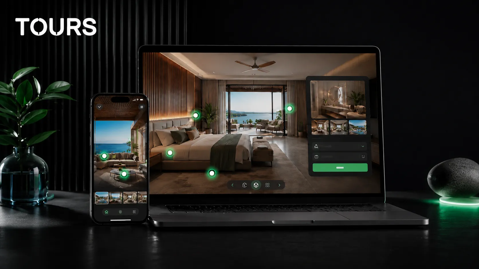
This is where hotspots come in. They are not just small icons placed over a panorama. Used properly, they become orientation points: some move the visitor to another scene, some explain a detail, others lead to a booking flow or an offer. The tour starts to feel like a presentation from someone who knows what is worth highlighting.
The main types of hotspots and what each one does
A hotspot is an interactive point placed inside a scene. The visitor sees it, clicks or taps it, and gets a clear action. Not every hotspot should do the same thing. In fact, a strong tour combines different hotspot types because each one solves a different need.
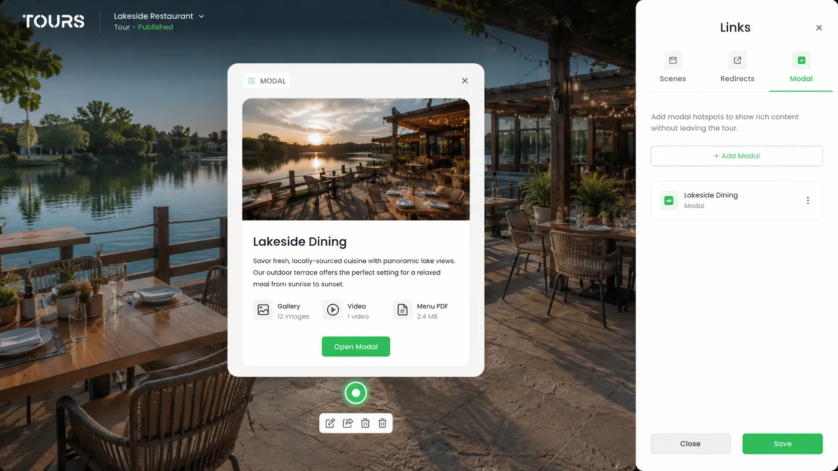
- Popup hotspot: opens a window inside the tour without pulling the visitor out of the experience. The popup can include text, images, video or a simple combination of these. It works well for room details, amenities, rules, views, menus, materials or any information that helps the visitor decide.
- Navigation hotspot: moves the visitor from one scene to another. For example, from reception to a room, from the room to the balcony or from the main dining area to the terrace. Without navigation, the tour remains a collection of disconnected images.
- Redirect URL hotspot: sends the visitor to an external page. You can use it for a special offer, a PDF menu, a product page, a form, a Google profile or a contact page. The key is to use it sparingly, only when it genuinely makes sense to take the visitor outside the tour.
The classic mistake is using navigation hotspots only. Yes, the visitor can move from one room to another, but they do not learn anything new. The tour works technically, but it does not persuade. To make it convincing, you need context: what the visitor is seeing, why it matters and what they can do next.
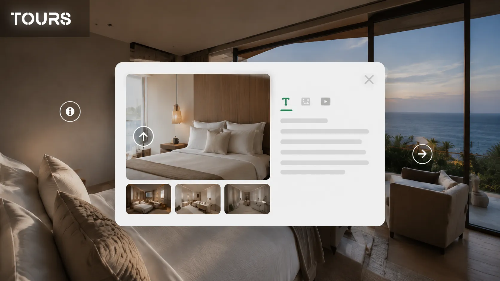
Information panels with text, images and video: what to include
The popup is where the virtual tour adds context. The panorama shows the space, but the popup explains the detail. It does not need to be long, sophisticated or overloaded. The best popups are short, clear and placed exactly where the visitor has a question.
- Short text: useful for concrete information such as room size, venue capacity, restaurant opening hours, amenities, rules or important notes. Avoid long paragraphs. In a virtual tour, people scan quickly.
- Image: useful when you want to show a detail that is not clearly visible in the 360° panorama. This could be a bathroom, a balcony, the texture of a material, a dish from the menu or a closer angle of a product.
- Video: best for atmosphere. A short clip of the terrace in the evening, an event venue prepared for a wedding or a showroom in use can say more than a long description.
- Action button: use it when the popup needs to lead somewhere: book the room, view the offer, request details, open the menu or check availability.
A simple rule: one popup should have one clear purpose. If you try to include price, gallery, video, a long description, reviews and three buttons in the same popup, the visitor no longer knows what to do. A clear title, one relevant image or video, two or three lines of text and one logical action will usually work better.
Pricing, location, and amenities directly inside the tour
In many cases, visitors do not need more photos. They need clearer information. They like the room, but want to know the price. They like the table by the window, but want to know whether they can reserve it. They like the event hall, but want to understand its capacity and facilities. If those details are hidden on another page, part of that interest is lost along the way.
That is why commercial information should appear in the scenes where people make decisions. There is no point filling the hallway with prices and long amenity lists. But in a premium room, a suite, an event space or next to a table with a great view, those details can make a real difference.
- Price from the booking system: when a scene or hotspot is connected to bookings, the price can come directly from the configuration of that spot. It can be a fixed price for a room or table, or a price that changes based on the number of guests.
- Manually set price: for spaces that are not booked directly, you can display an indicative price or a starting rate. This is useful for rentals, memberships, services, showrooms or event spaces where the conversation continues through a custom offer.
- Location: especially important when the space has a clear advantage: close to the city center, water view, separate access, private entrance, parking or proximity to a relevant landmark.
- Amenities: keep the list short. Do not include obvious items just to fill the popup. Highlight what helps the decision: balcony, bathtub, view, parking, projector, accessible entrance, Wi-Fi, air conditioning, capacity.
The useful rule is simple: put the information where the question appears. If the visitor is looking at a table, they should quickly understand how many people it seats and whether it can be booked. If they are looking at a room, they should know what is included and what the next step is.
Why an image gallery still matters
A virtual tour and an image gallery do not compete with each other. They complement each other very well. The 360° panorama provides context: what the space looks like, how the areas connect, how large the room feels, where the table is, what the entrance looks like. The image gallery adds the close-up details that the panorama does not always show clearly enough.
In a hotel, the gallery can show bathroom finishes, bedding, the balcony or the view. In a restaurant, it can show dishes, the evening atmosphere or design details. In a showroom, it can show materials, textures, products or different configurations. The visitor does not need to leave the tour to look for photos on Google, Instagram or Booking. Everything is in the same place, next to the scene that caught their attention.
Contextual actions: when the hotspot becomes practical
The best time to ask for a booking is the moment the visitor is convinced. The problem is that many tours force them to leave at exactly that moment: open a new tab, find the booking page, enter information again, choose the room or table again. Every extra step is another chance for the visitor to postpone or give up.
A booking system integrated directly into the tour reduces that friction. The visitor sees the room, checks the details, looks through the gallery, reads the price and can book from the same experience. In a restaurant, they can choose the table or area they like. In a guesthouse, they can book the room they just explored. For an event space, they can start a booking or inquiry from the scene itself.
- For accommodation: enable the booking system inside the tour so the visitor always has the booking button available in the interface. They do not have to search for a separate contact page after seeing the room.
- For restaurants: use contextual booking for tables. The visitor can click a table or a configured area, and the booking action appears exactly where the decision is made.
- For event spaces: use the global booking button for the space presented in the tour. The visitor sees the venue, understands the atmosphere and can start the booking process without leaving the experience.
- For showrooms: use booking for appointments, demonstrations, visits or consultations. The goal is not necessarily an instant sale, but turning interest from the tour into a real meeting.
Tours is built around this idea: a virtual tour with hotspots, customizable information panels, navigation between scenes, redirect URLs, image galleries, optional price and amenity details, plus integrated bookings for rooms, tables or other types of appointments. Everything is configured from a visual dashboard, without code, and the platform can be tested free for 30 days with no credit card required.
How to plan the visitor journey inside the tour
Interactivity does not mean putting as much as possible on the screen. It means creating a path that makes sense. The visitor should understand where they are, what they can see next and where they can take action. If every scene offers too many directions, the tour becomes tiring.
- Entry scene: choose a strong scene, not necessarily the first photo you took. It could be the reception, the terrace, the best room, the main dining area or an angle that immediately shows the value of the space.
- Orientation scenes: use clear navigation hotspots so the visitor understands how the spaces connect.
- Decision scenes: this is where you add the important details: price, amenities, gallery, video, availability or booking button.
- Action points: do not leave the booking only for the end. If the visitor is convinced inside a room or next to a table, the action should be available there.
- Useful exits: for visitors who are not ready to book, use redirect links to an offer, menu, contact page, Google profile or other pages that can keep them close to the decision.
A simple test: open the tour as if you were a customer. In the first 30 seconds, you should understand what you are seeing, where you can go and what you can do if you like the space. If you have to guess, the hotspots are not clear enough.
Mistakes that make an interactive tour weaker than a simple one
An interactive tour is not automatically better. If it is cluttered, confusing or hard to use on mobile, it can damage the experience. Most problems come from trying to put everything into the tour without a clear hierarchy.
- Too many hotspots in one scene: when every object has an icon, nothing feels important anymore. For most scenes, 2-4 relevant hotspots are enough.
- Popups that are too long: people do not open a virtual tour to read large blocks of text. Keep the copy short, concrete and visual.
- Hotspots with no clear cue: if an interactive point does not suggest what it does — navigation, details, gallery, video or booking — many visitors will not click it. Use suitable icons, short tooltips or simple labels so people immediately understand what happens after the click.
- Redirects used too early: if you pull visitors out of the tour before they have seen enough, you break the experience. External links should be useful, not a lazy shortcut.
- Weak mobile experience: hotspots that are too small for a finger, popups that are hard to close, slow galleries or buttons that are difficult to tap. If more than 70% of virtual tour views come from mobile, testing on a phone is not optional. It is the first thing you should do.
The best interactive tour feels simple to the user. Behind the scenes, it may include logic, rules, bookings and different types of content, but on screen everything should feel natural: see, understand, choose, book or request details.
Frequently Asked Questions
How many hotspots should I add to one virtual tour scene?
For most scenes, 2-4 well-chosen hotspots are enough. What matters is that each hotspot has a clear role: navigation, detail, gallery, video, offer or booking. If you add too many, visitors will not know where to click.
Can I add video to a virtual tour hotspot?
Yes. A popup can include text, images and video. Video is especially useful when you want to communicate atmosphere: a terrace in the evening, an event venue prepared for a private event, a lounge, a view or a short room presentation. Keep it short and relevant.
What is the difference between a navigation hotspot and a redirect hotspot?
A navigation hotspot moves the visitor to another scene inside the same tour. A redirect hotspot sends the visitor to an external page, such as a menu, offer, product page or form. Navigation keeps people inside the tour, while redirects connect the tour with the rest of your website.
Should I show the price in every scene?
No. Price should appear only where it helps the decision. In context scenes, such as a hallway or exterior area, it may be unnecessary. In commercial scenes — room, suite, table, event hall or premium space — a price or starting rate can reduce questions and speed up the decision.
Can I receive bookings directly from a virtual tour?
Yes, if the tour is connected to a booking system. In Tours, visitors can book rooms, tables or appointments directly from the tour, without being sent through multiple separate pages.
Do I still need an image gallery if I already have a 360° tour?
Yes. The 360° tour shows the space and orientation, while the gallery shows close-up details. For hotels, restaurants, showrooms and real estate properties, the two formats work best together.
Sources
Studies and reports cited in this article
All sources are checked and publicly available.
- Gecko Digital: 5 Hospitality Virtual Tour Metrics That Predict BookingsSource
- Market.us: Virtual Tour Market Statistics 2026Source
- Virtually Anywhere: How 360 Video Tours Impact Conversion RatesSource
We carefully select trusted sources to keep the content relevant and up to date.